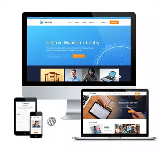
WordPress one-page designs offer modern, attention-grabbing websites with easy navigation and responsive design for optimal user experiences across all devices. These versatile themes are suitable for portfolios, service presentations, or e-commerce, enhancing SEO rankings, traffic, and sales. Key elements include fast loading times, strategic call-to-action buttons, clear product displays, and seamless navigation to guide users through the buying process. Popular themes like Divi, Avada, and Elementor with drag-and-drop builders and WooCommerce integration empower both developers and non-technical users to create dynamic e-commerce sites with enhanced UX and search engine optimization.
Discover the power of WordPress one-page designs! This comprehensive guide explores how to create stunning, effective websites using WordPress. From understanding the basics and benefits of responsive design to crafting engaging e-commerce sites and choosing popular themes, we’ve got you covered. Learn key elements for success and optimize your site for exceptional user experiences. Unleash your creativity with these insights into maximizing WordPress themes for one-page wonders.
- Understanding WordPress One-Page Designs
- Benefits of Responsive WordPress Design
- Creating Engaging E-commerce Sites with WordPress
- Popular WordPress Themes for One-Page Websites
- Key Elements of a Successful One-Page Design
- Optimizing Your WordPress Site for User Experience
Understanding WordPress One-Page Designs
WordPress one-page designs are a popular choice for modern websites, offering a sleek and minimalist approach that captures attention. These designs consolidate all the essential content onto a single page, making navigation intuitive and user-friendly. By leveraging responsive WordPress design principles, these sites seamlessly adapt to different screen sizes, ensuring an optimal viewing experience across desktops, tablets, and smartphones.

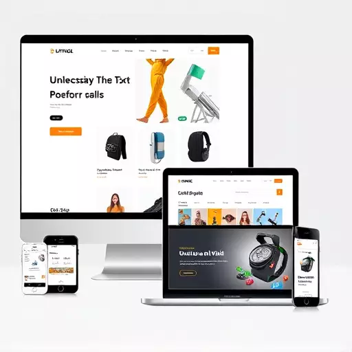
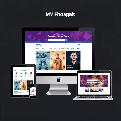
One-page WordPress themes are versatile and can be tailored for various purposes, including portfolio displays, service presentations, and even e-commerce WordPress sites. This flexibility allows businesses to showcase their products or services in a visually appealing manner, while responsive design guarantees that their online presence remains consistent and accessible no matter the user’s device.
Benefits of Responsive WordPress Design
In today’s digital landscape, having a WordPress site that adapts seamlessly to various screen sizes is no longer a luxury but a necessity. Responsive WordPress design ensures your website looks and functions perfectly on desktops, tablets, and mobile phones alike, providing an optimal user experience regardless of the device used. This is particularly beneficial for businesses focusing on e-commerce WordPress sites, as it allows them to reach a wider audience and boost sales by eliminating the frustration of users struggling with a poorly designed site on their smartphones or tablets.
For WordPress themes that are responsive, website owners can expect improved search engine optimization (SEO) rankings, as Google and other major search engines prioritize mobile-friendly sites. This translates into better visibility for online businesses, driving more organic traffic to their sites. Furthermore, a responsive design streamlines the content creation process, eliminating the need for separate desktop and mobile versions of your site, thus saving time and resources in the long run.
Creating Engaging E-commerce Sites with WordPress
WordPress one-page designs offer a powerful platform for creating engaging e-commerce sites. With a vast library of high-quality, responsive WordPress themes available, businesses can easily establish an online presence that caters to modern mobile users. These themes are designed with flexibility in mind, allowing merchants to showcase products and services effectively across various devices without compromising visual appeal.
By leveraging the capabilities of WordPress, developers and non-technical users alike can build dynamic e-commerce sites that provide a seamless shopping experience. Responsive design ensures your store looks great on desktops, tablets, and smartphones, while built-in e-commerce functionality simplifies product management, payment processing, and order tracking. This combination makes WordPress an ideal choice for businesses looking to establish or expand their online retail presence.
Popular WordPress Themes for One-Page Websites

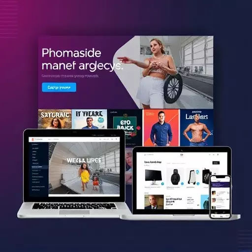
When creating a one-page website on WordPress, choosing the right theme is paramount. Popular options cater to various needs, from showcasing portfolios and creative works to launching e-commerce stores. Many modern WordPress themes come with responsive design features, ensuring your site looks great on all devices. This is crucial for reaching a broader audience in today’s mobile-first world.
For instance, themes like Divi, Avada, and Elementor offer versatile layouts and drag-and-drop page builders, making it easy to create custom one-page designs. Additionally, WooCommerce integration makes it seamless to transform your site into a robust e-commerce platform, expanding the possibilities for online sales. These themes not only enhance user experience but also optimize sites for search engines, making them valuable assets for any WordPress one-page website venture.
Key Elements of a Successful One-Page Design

A successful one-page WordPress design is a delicate balance between aesthetics and functionality, tailored to capture and retain visitor attention. Key elements include a responsive WordPress design that adapts seamlessly across devices, ensuring your site looks as stunning on mobile phones as it does on desktops. This not only enhances user experience but also positively impacts SEO rankings.
For e-commerce WordPress sites, strategic placement of call-to-action buttons, clear product displays, and seamless navigation are crucial. Incorporate high-quality visuals, compelling copy, and intuitive forms to guide visitors through the buying process without frustration. A clean layout, optimized for fast loading times, further bolsters user engagement and encourages conversions.
Optimizing Your WordPress Site for User Experience

Creating a one-page design on WordPress isn’t just about aesthetics; it’s optimizing for user experience (UX). Choosing the right WordPress themes that prioritize responsive design ensures your site looks great and functions seamlessly across all devices, from desktops to smartphones. This is crucial for retaining visitors who increasingly access content on mobile.
For e-commerce WordPress sites, UX optimization takes on added importance. A well-structured, user-friendly layout enhances navigation, allowing customers to browse products effortlessly. Combining this with fast loading times and a clean design fosters a positive experience that can drive conversions. Remember, a responsive WordPress design that adapts to different screen sizes isn’t just about convenience; it’s about improving engagement and ultimately boosting your site’s performance in search engine rankings.